
MASS SATISFACTION REQUIRED
My firm flew me to Toronto to be the solo designer for multiple B2B apps and websites for the Royal Bank of Canada: the #1 bank in Canada and #5 in the world. The project was very extensive and took months to finish just the design phase. I interviewed business analysts from the US, the UK, and of course Canada to get their feedback and what kind of features they wanted to achieve their daily tasks. RBC also had multiple websites from multiple eras in the past and they all needed to look uniform and modernized. This required an in-depth analysis of how each retro website works and how I can reformat all of them into a homogenous design for desktop and mobile.
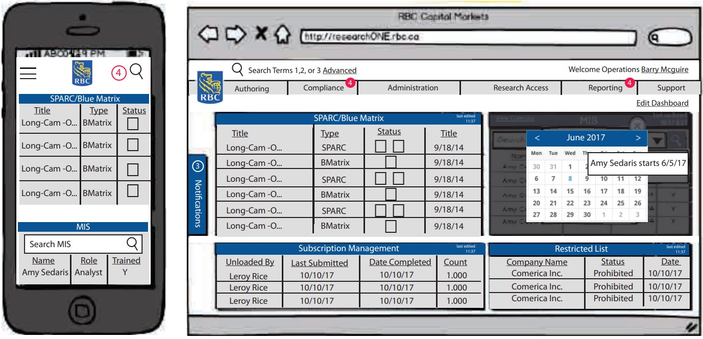
MANY MANY WIREFRAMES
When interviewing RBC employees, I made them tell me their own ideal homepage dashboard catered to their own likings. This would reduce clicks needed because the analysts could view all their important, simplified information along with notifications so the user could take care of whichever actions were the most urgent. I made this all easily accessible immediately within the dashboard homepage.
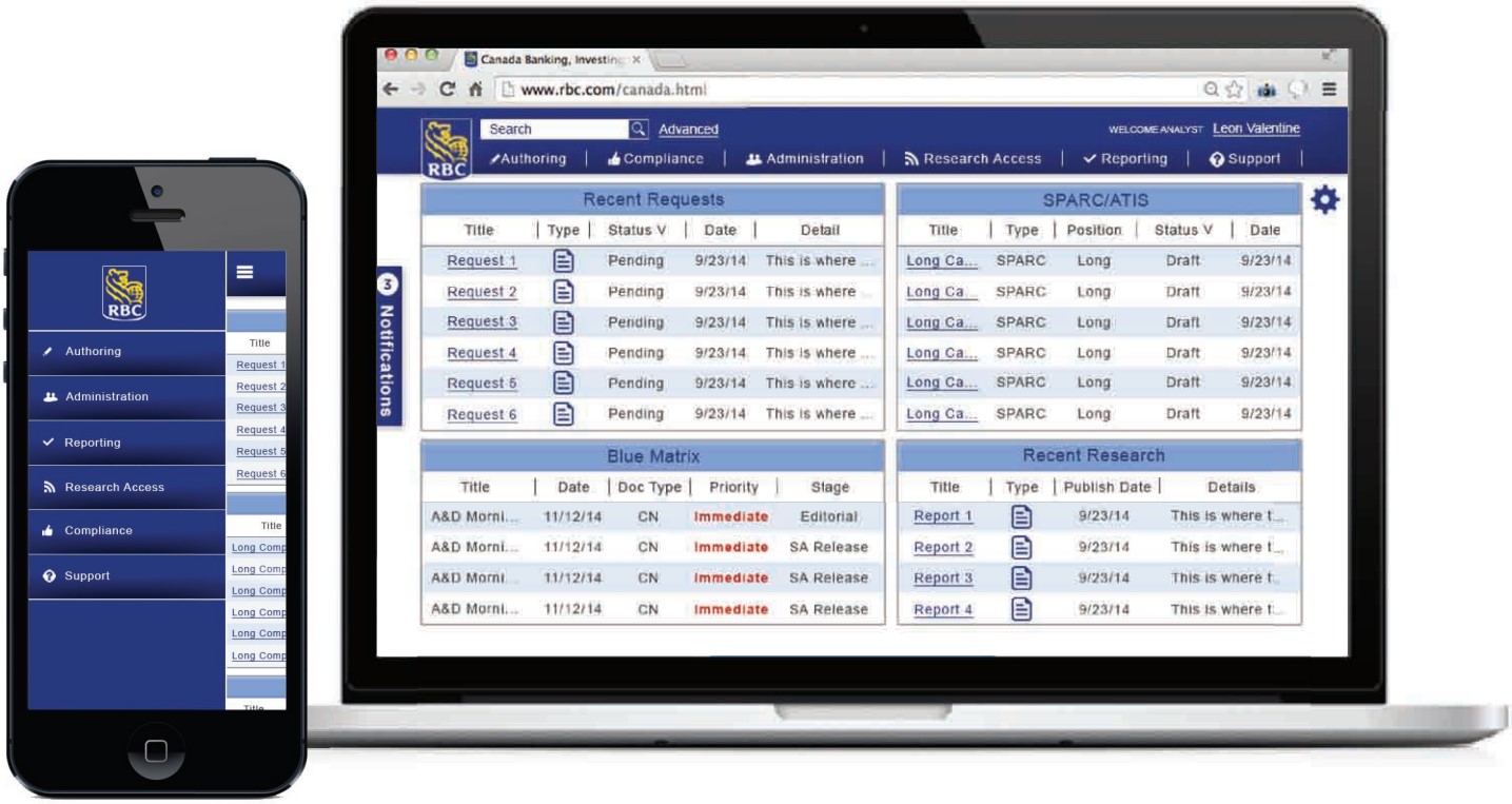
FINALIZED MOCKUPS
After the wireframes were all painstakingly finished, next came the mockups. I needed to keep the color scheme within RBC’s royal blue color family but also make priority statuses and notifications stand out. Red was the obvious choice. An icon family was also implemented for faster feature and action association for more seasoned users.
RESULTS
My firm’s developers created all the different desktop sites and mobile apps much to the satisfaction of RBC employees across the globe. To this day, business analysts are using my creation to do their day-to-day job.