
Viggle is an app where you can log in your TV watching hours, accumulate points, and then exchange those points for real life prizes. Think of it like Chuck-E-Cheese but instead of playing games for tickets, you’re watching TV for prize points. Using the app’s recognition technology, the app could tell you what show you’re currently watching. The design challenge: how do you translate all these unique features into Windows Phone and Surface’s strict design guidelines?
WINDOWS RESEARCH AND VIGGLE RESEARCH
The first step is extensively review Windows Phone/Surface guidelines and what makes them unique. Horizontal scrolling, icons for actions, plain text for buttons, everything is tappable. The list goes on. Viggle’s app already existed on Apple and Android, so the research included extensive app use and interviews with the original designers and the company stakeholders. Other meetings included approval by Microsoft employees themselves.
THE UX SOLUTION
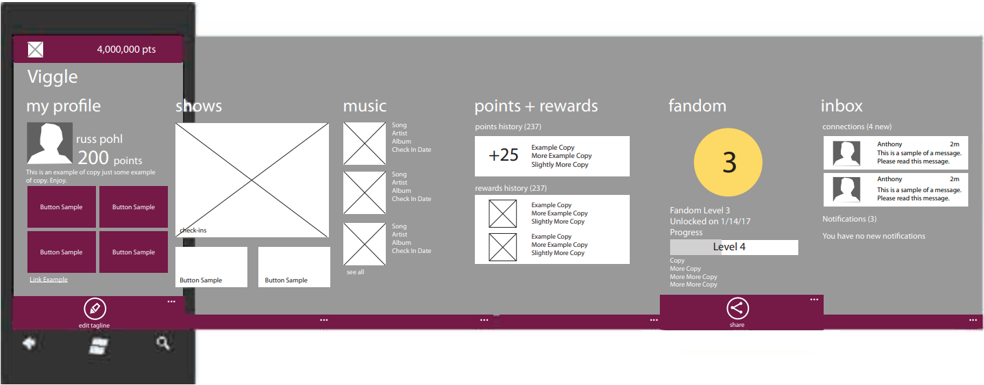
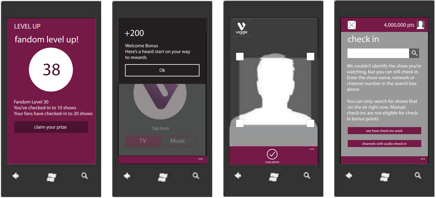
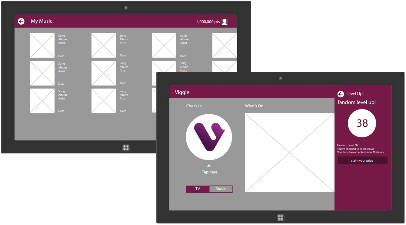
Marry the established design language of Viggle with the design guidelines for Windows. Translate buttons into text links, move actions into the bottom bar, morph the homepage into a horizontal scroll. Of course wireframes come before mockups and approval at every stage is needed by both sides.
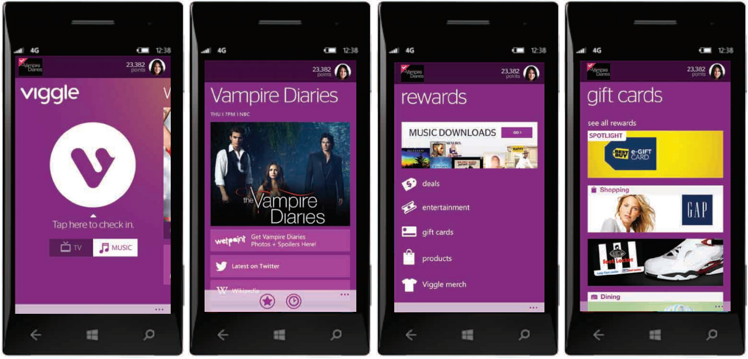
THE UI SOLUTION
After wireframe approval comes the final UI mockups to be developed. Viggle has a really unique purple color scheme and along with the all the TV show photos, this design really sings and stands out among more utilitarian apps.

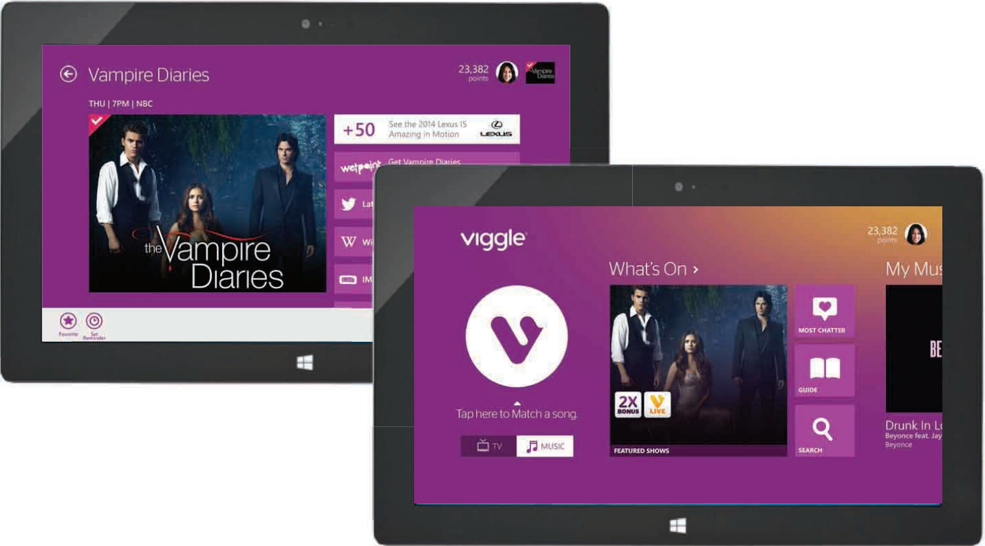
OUTCOME
During the Windows Phone & Surface’s short run, Viggle really stood out as a cool and unique app in the store. It won the approval of both Viggle and Windows stakeholders. Viggle continues to help users turn watching TV into something both fun and productive.